Showing posts with label color. Show all posts

Thursday, March 27, 2014

April Storyteller & Colds


Sussex County, Delaware- Route 1- March 2014 by Carrie Arick- digiscrapgeek.blogspot.com


It's almost April and there's still snow on the ground, my allergies are in full swing- I can literally feel the pollen coating my body- and we're all getting over a nasty cold. My hubby brought home germs from the hospital. He has bronchitis and I suspect my kid's lingering cough may be a mild case of it, too. I got off easy with non-chest cold. This is not the best way to start spring. It also might be my personal hell.

James the cat doesn't like any of this. Snow and muddy ground ruin walks. Sick moms nursing her family back to health while doing chores and creating pages don't have time for play. He pretty much hates me until I get out the cat treats. Yet, he does love my kid.


The Page: I made this page with the April Storyteller by Just Jaimee. This month departs a little from Jaimee's normal color story- it's warm, analogous color mixed with cork, black and whites. It's color expertly constrained with Jaimee's signature graphic, playful style. I played the color scheme by using a warm, golden processed photo.


sickie snuggles-March 2014 by Carrie Arick- digiscrapgeek.blogspot.com


I'd originally intended to use three photos on this page- a series. I decided it against it when I realized each photo made me think of a different story. This one is cozy and comforting... it's really about the bond these two share. I created a feeling of cozy warmth by using a bracket foundation, clustering, color, and a lot soft and smooth textures.

The Story: James was a godsend at the peak of my kiddo's cold. The last time my kid was sick, there was shrill, terrible, tear inducing screams of agony that made high tail it to ER at 11pm. (thanks, Autism)  Right before the screaming started (because we can see it coming from a mile away), this happened. James comforted him in a way that was acceptable to the kiddo's sensory system. James, who is not a lap cat at all, knew what his boy needed.

James is a special cat and he was rewarded.


Storyteller Inspirational Magazine by Just Jamiee via Carrie Arick- digiscrapgeek.blogspot.comBack to the kit... I love it. I've made a few more pages with it that I can't share yet. As much as PSE speed and limitations drive me crazy, I've gotten a lot of mileage out of Jaimee's styles. This month includes a vellum style- YIPEE!! I adore the alphas and am happy that there is both a serif and sans serif. There's so much good stuff that you should probably just pick up the whole collection. If you subscribe to her newsletter (scroll the bottom of the main page), you can pick it up for a sweet price.

Jaimee created a FREE magazine full of inspiration, tips and tricks to go along with April Storyteller!

 photo 2faeb505-33f5-4d99-8a21-43b16f7025a3.jpg

Tuesday, February 18, 2014

Inside GIS: Black, White and Beige deconstructed design

Oh how I love using black, especially for text. It's classic. It grabs the eye. It can add a punch of color without using color. If I don't use black on page, there's a good chance I'm using a white or a beige in a similar way.

This page came together easily. I just happened to pull out all the neutral pieces I loved and let them do the work. The work is really in the intentional use and placement of each element.


love this 2

When I first signed up for the Critique Workshop over at Get It Scrapped in 2012, my goal was to learn how to scrap with intention. This is not an uncommon goal for memory keepers. The subject comes up over and over again at GIS and in Office Hours.

At first glance, you may just see color and shape, words and doodles and bits of paper making a simple page. If you look deeper into the page you may see the use of design principles and symbolism in this page. In case you don't, let me break down my intention for you:

1) The background paper. It's beige, it's got some messy spots and it's lined. The messy spots are not just symbolic of discomfort, but also gave me a place to start my composition. The lines help you move left to right, from title to photo. The color is soft, just like a kitty.

2) The photo. It's sepia toned to bring out the squinched up face while keeping the idea that kitties are soft and lovable even when they say "eww".

3) The circles.  Circles are a visual representation of predictable cycles. This face happens regularly at predictable moment. The predictable nature of a circle also makes a stable foundation for a loose composition.

4) The frame. We frame things that are special to us, but getting a photo of this sort of moment with an animal isn't easy to capture, which is why the frame sits behind the photo.

5) The title. It's a direct statement of my feelings. It physically supports the left side of the photo (adding balance), keeping the photo cluster from feeling like it will tip over. It also adds visual interest and energy with it's contrast and lines. It is softened just a tad by creamy, transparent version underneath.

6) The doodled line. It frames the page, so your eye gets ping-ponged back up the page. The lines also symbolize time passing.

7) The bow/string. These are a few of my favorite things... The expression makes me laugh and laughter is a gift. James is a gift, really. The lines of the string feel like they are in motion, which works great when your story is about action. It connects the title and photo cluster, too.

8) Journal strips. I digitally cut these. They were rectangles that are warped and skewed to make them feel hand cut. I also warped the text to match the curves in the paper as it pulls away from the background. The strips add visual interest, energy, but also stability because of their repetition.

9) Stitches. Not only do they add polish to the page (affixers do that), the angle of the stitches lead us into the composition.

10) Tape and sequins. Sparkles and glitters add a sense of motion to any layout because our minds know they continuously reflect light. (think Gestalt)  Using these embellishments is an easy way to add interest and polish to page at the same time.

A simple page is rarely ever simple. You can't hide mistakes and you must rely on the principles of design to pull it off. If you want to know more about the design principles, I highly recommend joining us with a Get It Scrapped membership.

 photo 2faeb505-33f5-4d99-8a21-43b16f7025a3.jpg

Friday, December 20, 2013

Purple toned snow

I admit it. I'm jealous of all my friends who've had snow, especially when a good portion of them live just across the Chesapeake Bay. All I want to is throw a snowball and make a snowman in December. Just once.

I made this layout expressing my yearning for the magic rain that falls from the sky using MSA's December Art Social (which you can grab for $1.99 with the awesome coupon).


Two things to note about this page:

1) Look at those purple tones I managed to use.
2) I grabbed a screen shot of our forecast for the week and used it here.

I let the paper and the screen shot dictate the design. The paper allowed for an obvious foreground and background and it made sense to me to use the screen shot as part of the scene. I used a blending mode (luminance I think) to get it to match the paper. The deer worked perfectly in the design and I built on the sweet curved line their antlers make by using the snowflakes.

This may be my trick for using purple in 2014: lean hard on things other than color.

In the end, I really like the page. I think it's cool to preserve the week's weather while expressing my dissatisfaction with it. It's going to be 60+ degrees today, which is 5 days before Christmas. When did I move to the Southern Hemisphere? Oh well. The day after I created this page, I woke up to this:


It melted by 10 am, but I'm glad I was able to see it. Asked and answered, right?

♥ Carrie


Monday, August 5, 2013

Mojo Monday Project: Product Inspo- Color Focus

One of the Get It Scrapped forum topics last week asked for help filling mojo back up.  Everyone chimed in with such great ideas that it inspired me! I've decided to keep my blogging more regular-like, I'm going to do a post every Monday to get our mojo on.

What is mojo? It's the internal stock of creativity you project out to the world. When your are mojoless, you need to explore the world around you to find more and do things to shake you out of your comfortable creative spot.

I'm going to break each Monday of the month into four categories: Product, Pinterest, Process, and Past. I'll scrap a page to show you how I've used these things to inspire me and hopefully get your mojo recharged, too!

Let's begin with the product that inspired me today:

Digi Scrap Addicts'  Group Therapy | Life – Defined collection. Now a little disclaimer-- I did find this because Just Jaimee contributed to this collection. Before that, I wasn't even aware it existed. But boy, was I pleasantly surprised when I saw the giant inspo e-zine you that requires zero purchase!

The colors of the kit were completely outside my comfort zone. To me, orange says Halloween and fall. Even for Halloween and fall, I am not drawn to orange. The times I have used orange en masse are on pages I kinda want to forget. I had this kit in front of me full of oranges and decided to turn aversion into color focus challenge. People scrap great pages with orange all the time, so I should be able to do it, too!

Product Mojo tip #1 & #2: Start with a open mind, positive attitude and embrace product outside your comfort zone. Then go look at amazing pages made with product you wouldn't normally use.

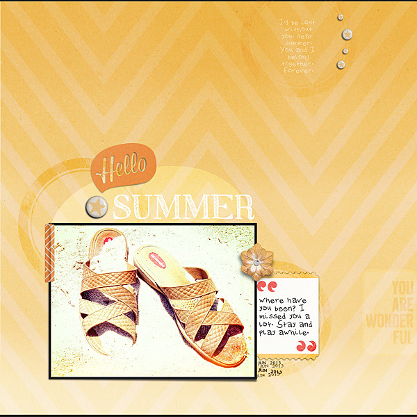
I decided to go all in with the color orange. I started by thinking about what the particular shades of orange in the collection made me think of... and it was definitely sunshine and warmth. That led me to photos taken on a super sunny day at the beach (instead of the normal humid haze). There was a shot of my sandals in the sand that was rather monochromatic which I decided would fit perfectly with a color focused layout.

Product Mojo tip #3: Let the Product inspire the story and pick photo(s) accordingly.

Since my photo's colors didn't quite match the orange papers and embellishments, I used my handy-dandy free photo filter program, Photo Effects 4, to add some orangish filters, a little over exposure and a little light leak to the image. It took me only a few minutes to tweak, which is why I use Photo Effects instead of PSE or PSP.

Original:


Edited:


I picked out the orange chevron and solid orange ombre from Jaimee's contribution the collection. While I loved the ombre of the solid orange, I liked the movement and texture of chevron. I decided to blend the two together so I could have ombre, movement and texture to mount set the mood for my summery page.

I put my photo at the bottom of the page because it seemed to ombre itself down there (see the page below). Notice the overexposed bit matches the bottom of the background. Serendipity! I decided to help my photo stand out, I'd edge it black. That gave the photo a funky, unexpected contrast and there's no doubting that it's definitely the focal point!

I created my title using a speech bubble and sketched title font in white. If I'd use an alpha or a dark color for the word 'summer', it would become really heavy. Sunlight is not heavy, so the sketched font keeps things airy and light. Shoes don't talk (yeah, I actually said that to myself while scrapping) and the speech bubble didn't happily make a smooth transition from the photo, so I added in the star flair. Now the star is saying "Hello" and we all know (I hope) our sun is a star meaning the summer them is reinforced by that flair.

There are some great journaling labels and word art I wanted to include in the page, but again using them as is killed the light and airy feel of the page. I still liked the shapes they created, so I decided to try blending  them (screen, dodge and overlay are awesome) and then fiddling with the opacity. That's my secret weapon for wanting to add it all without making a heavy page!

I used a journaling card for actual journaling and added that flower to ground it together with the photo. I picked this particular card because of the red quotes for two reasons: Firstly because they work with the red label on the sandals in the photo. Secondly because the star flairs are more yellow-y, the red balances out deviation from orange. Red and yellow make orange therefore you can have a little of each on an orange focused page to add subtle tension without throwing things off. Try it- it works.

Finally I added my journaling in two spots, defined that top journaling spot repeating the flairs (small, contrasting with the big one in the title), added some date stamps and framed the top and bottom edges with black to keep your eye in the page. (I like to call that framing of the edges "visual Pong")

I hate orange, but I love this page!

Product Mojo tip #4: Design the page with intention. It really works when attempting something outside your comfort zone.

The Result:

Hello Summer

Now I challenge you to try using product and colors that don't thrill you. Feel free to share your creations with me in the links!!

♥ Carrie