Showing posts with label fonts. Show all posts

Wednesday, May 14, 2014

GIS: Linocut Look

My latest page for the Get It Scrapped blog is rockin' a linocut look. It's not something I'd ever considered until the assignment, but I found myself loving it. You can see the article, which features all sorts of tips and approaches to the technique, HERE.

Linocut is a handmade, carved stamp that artists use for quick production. You can search Pinterest for a better idea or just read the article. I'm glad I work digitally because I don't have a good track record with Exacto knives!

For my page, I used layer styles to get the look of a linocut. I'm currently having a love affair with layer styles. They may be the one thing that pushes me over to a Photoshop subscription.

Fell in Love by Carrie Arick ( Created For: Get It Scrapped: Linocut Look)
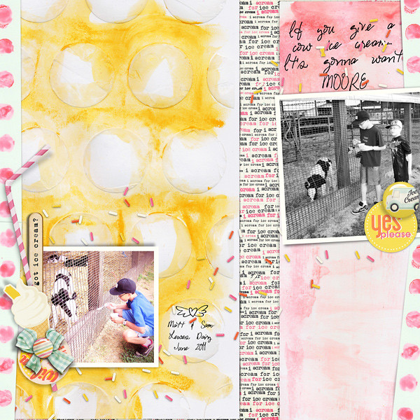
Jenni Bowling Studio: County Fair; Just Jaimee: Storyteller Collection- February 2014 Layer Styles, Ice Cream Paper Pack; One Little Bird: Lemon Drop Elements; HGD by Laurie Ann: Today’s Story; Fonts: Marcelle Script, Things We Said, Pea Stitchasaurus Rex

I used the Jenni Bowlin's primitive feathers available in the County Fair kit because they have that handmade feel. I used Jaimee's stamped layer styles to make the one feathers into a negative and positive stamp.


I found that font through a page by Vicki Bridges at The Daily Digi. It's an awesome, free font called Things We Said. The vellum bits add a some color and texture to the page without overwhelming anything while the pennants add a sturdy foundation that frame the title.

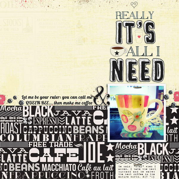
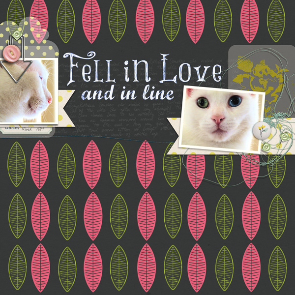
Oh, and that's my bossy little kitten, Katniss. She is definitely the queen of the house.

 photo 2faeb505-33f5-4d99-8a21-43b16f7025a3.jpg

Thursday, April 3, 2014

I'm an ice cream snob

My dad raised me as sort of ice cream connoisseur.  I grew up across the street from the family that owned Hovermale's Taste Best, whose frozen custard is probably the best in the country and very close to the Danish version based on my extensive sampling.

Vanilla is my absolute favorite flavor. I can tell real vanilla from artificial vanilla, cream from milk, frozen dairy product from ice cream. My palette has skills that drive my husband, the ice cream purchaser in our house, absolutely bonkers. His only safe bet, other than ice cream from our local dairy, is Ben and Jerry's.

If it's not a decent ice cream, I pass, unless there is cake involved.

I made this page about my vanilla love. I almost titled it "Vanilla Isn't Vanilla", but that title didn't go well with this composition. The kit is Just Jaimee's contribution to this month's BYOC at The (dash) Lilypad. It consists of elements and two paper packs- regular and painted.

My Favorite
I've been trying to incorporate more pattern papers into my layouts, so I digitally cut hearts out of the painted papers so I could use them. The burst background makes it easy to decide where the compositions lives because all the lines lead to center.

The hearts gave me the option of breaking out of the center enough to be visually interesting while remaining connected to the burst pattern. They also helped the circular embellishments make more sense with all the hard lines. The polka do paper adds a bit of grown up-ness to the page,  creates a shelf for the the cluster and gave the journaling a place to live.

And here's a bonus page. I just did some free scrapping. It's not my favorite, but at least the memory is recorded. Good new! You don't have to love every page you do.

Moore

Can you tell I like that font? Pea Miley Mix it's called... not too far from my own handwriting, which I plan on making into a font, but haven't gotten around to it.

Oops! I lied! That font is Pea Stitchasaurus Rex, available free HERE.

 photo 2faeb505-33f5-4d99-8a21-43b16f7025a3.jpg

Saturday, November 30, 2013

I ♥ coffee & words

I do. I love coffee. It doesn't like me so much so I can only drink decaf or half-caf, but it's still my daily beverage of choice besides water (from the tap because I am a rebel).

I have no shortage of coffee themed layouts. Okay, I only have 3, but it seemed like a lot in my head.

tlp-jun-template-challengewcoffeeadvrnturew

The pages above I did back in May. The one below is my latest homage to coffee. For this latest layout I decided to to play a little since I'd already jotted down my love of coffee and my excitement trying new blends, beans and brands. Since I've been listening to WOTE's cover of Lordes song Royals I thought it would be apt to to twist the lyrics into my title and subtitle. My journaling is about my hubby being my dedicated and loving barista. And when I asked him if he'd call me ruler without missing a beat he said okay. Yeah, he's awesome.

really it's all i need

I really, really liked the colorful photo of my coffee cup and I loved the rhythmic, wordy paper. Together they'd just be too overwhelming, so I used the creamy covered newsprint to calm things down. Because of my song lyric inspiration, I used words like embellishments. I'm kinda in love with typography lately.

Anything I put on that bold, wordy paper might have gotten lost. That was a problem solved by the paper's design itself. I just aligned my photo and journaling card with the stars on the paper. Doing that tricks you into thinking it's more word art in the vertical column than word pattern paper.

I did use a few small embellishments to fill in the holes on my page and polished up the page with staples and paint splatters (because I always need a bit of mess on page).

This is a really great kit and I wanted to USE ALL THE THINGS!!! But using less things worked a lot better. Oh, and the kit is on sale this weekend. BUY ALL THE THINGS! :)

♥ Carrie

Friday, November 22, 2013

November Storyteller and Your December Story just met

It's time for another Storyteller Collection! While I'm woefully behind on my month pages, November is pretty much done. It's going to be included in my December Story album, too. Two birds, one stone.

I haven't put journaling on these pages yet, but I plan to. If I don't, then the title really does say it all. This is a glimpse into our daily life before the holiday as prompted by YDS Lesson 1.

I used a template for this page, which I rarely do, but I know myself. If I didn't jump on the inspiration, I might not make the page. The template did the heavy lifting. Thank goodness for Crtl + G.


Just an Ordinary...(left side)

I used almost every part of the collection. I decided I'd make a title with the alphas to sum up our challenges this time of year. I wanted to be real, but not depressing, wanted to make sure it was our collective challenges, but not to general. Yet, I didn't want it to be depressing either. Here's what I came up with:

Just an Ordinary...(right side)

I'm really loving fonts and alphas lately. I have too many fonts, so I use Wordmark to sort through them when I'm creating something like this. You can type in the text you want to write, select the size and style, hit enter and Wordmark displays the fonts on your computer. It's a gem! You can also sort your fonts in lists, which Wordmark will save for you. For instance, I have a list of scripty fonts and typewriter fonts. It saves me a ton of time. Also, it's 100% free.

Overall, I'm happy with the pages and if I don't get to the journaling, I'm not stressing over it. Success!

♥ Carrie

Tuesday, September 17, 2013

Scrapbooking Ideas

Hello Everyone!

This week I find myself with a bit more downtime, which is perfect for some non-creative-team-free-scrapping. Since I've been doing the Photo a Day challenge, I have lots and lots of photos to choose from, which mean I really needed a little help picking which story to tell. I hopped on over to the Scrapbooking Ideas section of Get It Scrapped in hopes of finding a starting point.

I was immediately drawn to the title section. In it, I found an article about long titles and instantly knew what page I needed to make:


I Mustache U
Supplies: Just Jaimee: Storyteller Collection- September 2013: Fonts: Varsity Playbook, Sketch College, TrashButterfly,1942 report, 28 Days Later, Sketch Serif, Advert, Colleged, appleberry, Pea Melody Shay

The title of this page tells most of the story. Ever since I beat him at Mortal Kombat ten years ago, my hubby gets seriously focused on winning whenever we play a game together. He, apparently, doesn't like losing to a girl. The good news for him is that I am terrible at board games, but he isn't exactly a good sport. When we play an analog game together, I always joke that he should either be pulling my ponytail to express his affection or he's  just a cocky jerk.

For the title I used a mix of different stampy, chalky and sketchy looking fonts in varying sizes, but still large (I think the smallest is around 48 pts). I alternated between serif and sans serif fonts- so there's an AB pattern of words. To make the title block feel like one piece and because those ascenders and descenders kinda force pesky gaps between lines, the title also became an embellishment cluster. Pretty sneak, eh?

Also, I'm still swooning over Jaimee's kit (and not just because I'm on her CT). I love the ombre papers and wanted to use more. The ombre paper here really helps reinforce the title with contrast and flow. It's needed since embellishments are sparse. To finish the page off I added some small staples. If you're gonna pull off minimal embellishments, affixers like tape, staples, stitching or brads really make a page feel finished.

That's my creation from the inspo in a nutshell! Check out Scrapbooking Ideas for more great ideas, tips and tricks.

♥ Carrie