
I thought I'd give you a peek into my page on the Get It Scrapped blog today. I really loved the way page turned out. I also kinda love how flamboyant it is and the in your face the color palette. What I'm telling you here is stuff not included in the article, but that I think is worth knowing.
I created this page a week or so before my 37th birthday. I am one of those annoying people who doesn't really mind getting old. I certainly don't feel my age... actually, I feel like I'm still a kid at times. I love birthdays in general; Life's too short not to celebrate stuff... and eat cake... and get presents!
When I was thinking about ideas for the assignment, I started by shopping my stash. I was really drawn to the neon pinks in Libby Pritchett's Be Awesome (which I believe was part of August Digi Files). Looking through my photos, I couldn't find any story that fit the kit's motif AND colors. Normally if it's one or the other I can make any photo work.
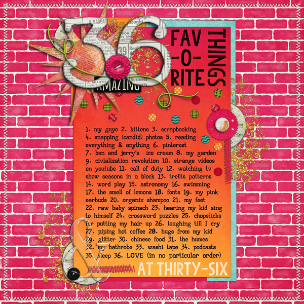
Eff it, I said, politely to myself. This page is going to be about me. I'd never done a list-ish type page before so I thought it would the perfect opportunity to try. I used my age to define how long the list should be. My hubby wondered if I even had that many favorite things, but it turned out I really did (and still do).
Because the assignment was rectangle on square, I started my page with a rectangle. I then used the buttons to plot out my curve (which is also the flow of the page). To get more info on the principle, go read the article!

Here is a quickie breakdown: This design makes the eye happy because Fibonacci said so and math and universe and junk. I'm putting the image here so you know what curve I'm talking about.
Since this is a photoless page, I had to create something interesting to look at. I decided to have fun with fonts by creating a snazzy title. The 'fav-o-rite things' was easy to make and I should really do it more often. When doing snazzy font work, remember to adjust the leading and tracking so the spaces between the letters and words don't look wonky.
The '36' cluster is really heavy on the page. Had I not added that pink cog, glitter, stitching and time piece under the button on the right, the '36' cluster would have toppled that whole rectangle and the design would have failed. The acrylic ampersand in the bottom left corner helps keep the weight of the left side from being overpowering as well. The confetti ties all of the elements together and eliminates trapped white space while the blue paper adds more dimension. Both confetti and paper add even more weight to the right side, making it feel grounded. Finally, no page (of mine) is complete without some framing around the edges, in this case stitches.
And if you want to learn all this neat-o design stuff, then come on over the GIS forums and take a class or two.
I hope you've enjoyed my breakdown and my wildly pink all about me page.
♥ Carrie
No comments:
Post a Comment
♥ Thanks for taking the time to comment. It is appreciated ♥