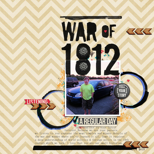
I uploaded my page into the MSD gallery to get feedback from Debbie, Anna and my fellow scrappers who were in attendance. Here's the original page in question:
I loved the big, bold title, the bold circles and swashy black lines. I just have an affinity for copious amounts of black media on a page with pops of color. Still something was bugging the heck out me.
It turned out that the collective eyes and brains in the webinar were able to pick out what the issue I only felt was and how I could fix it. The flower didn't fit the theme and the circle that surrounded it was unnecessary. I realized that I had no particular reason to have that flower there anyway. (except that I thought I ought to try using a flower) If I take away those elements, then the turquoise swashes need to be changed and Anna suggested using a blue in the photo. That's exactly what I ended up doing:

Supplies: Just Jaimee: Doodled Line + Circle Brushes Bundle, Storyteller Collection- September
(also available a la carte); Font: SimSun (on of my faves)
Now the page has a bit more of an Americana feel to it, which supports the story. It also feels more balanced and the parts feel connected. I am really glad I had the page workshopped (as we call it at MSD) because it made all the difference in the world. I really love the instant feedback!
If you want to check out MSD and see what the fuss is all about, you can now get a 10 day trail FREE! Use my affiliate link to sign up: Visit Masterful Scrapbook Design
And here's a little sneak peak of the live webinars (which are also posted as recordings you can access anytime and/or download):
♥ Carrie
P.S. Katie Scott did an amazing lift of my revised layout- check it out!


No comments:
Post a Comment
♥ Thanks for taking the time to comment. It is appreciated ♥