Pockets make me feel constrained when I sit down to design a page. I need a blank canvas to work. It's part of my creative process. I suppose I pull the design out of the negative space, instead of creating the positive space. I've come to accept that pocket scrapping is great to look at and to be inspired by, but it isn't me and that's okay.
I also love the idea of documenting every day life, the things that wouldn't normally make it onto a scrapbook page. This has been especially true since my hubby had brain surgery. His kiddos don't get the daily life experience with their dad, so this sorta scrapbooking meets that need. I know that when I talk about my ancestors, I wonder about the little things-- what did they eat, how did they shop, did they have pets, what made them happy during a bad day? There's so much info you can glean about a few words on the mundane.
At the beginning of this year (which was incredibly hard because we lost our beloved baby kitten, Revan, who was like a child to us...), I decided to tackle a year long project on my terms about every day life: A one or two pager round up on our month. I originally
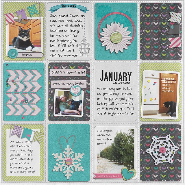
Here's January:
 credits: Valorie Wibben Pockets No 3.; Meg's Creations Captured My Heart; The Lily Pad Winter Wishes; Fonts: Mom's Typewriter, SF Movie Poster, Pea Lopez.
Meh. It's not that awful, but nothing about it is at all me. Still, I'm keeping it because it's a reminder of exactly that- not me.
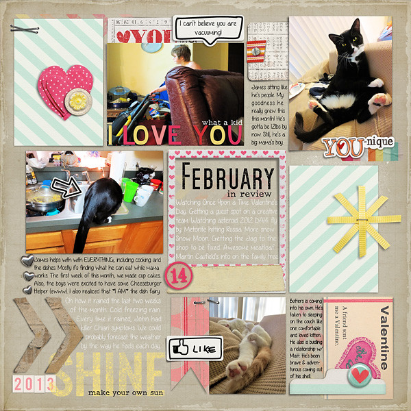
In February, I thought about my approach. Why not let the page come together organically? Take the pocket idea and put my own twist on it:

credits: Micheline Martin someone to Love, Artsy Bits Valentines Day; Pink Reptile Designs Lucky in Love; Allison Pennington Playground Love, Decorated Polaroids; Sahlin Studio Key to My Heart, XOXO, Type Set Alpha. Fonts: Angelica Rose, SF Movie Poster, F25 Executive
This page came together so easily for me. Incredibly easy. It flowed. It has that PL/pocket page feel to it, but it's also fun and free spirited (like me!).
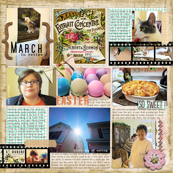
I did the same for March:

credits: Julie Kniepp A Slice of the Good Life; CD Mucosky Blessed Beyond Belief. Fonts: SF Movie Poster, Bohemian Typewriter, Yummy Cupcakes
Again, this page flowed and I really enjoyed creating it. That's the key. Don't create in a way you don't enjoy.
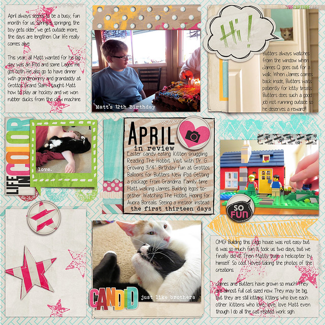
My April page I decided was going to be a two page spread. I was just super excited at this point and had a ton of photos to use. I've still got page two on my virtual desk, but I already love page one:

credits: Just Jaimee April Storyteller Bundle. Fonts: SF Movie Poster, Yummy Cupcakes, Bohemian Typewriter
Not only do I love this page soooo much, I also loved the Storyteller kit. I realized that it married my project, my aesthetic and my process-- serendipitously! While I still have page two to do, I'm chomping on the bit to start May's page.

No comments:
Post a Comment
♥ Thanks for taking the time to comment. It is appreciated ♥