I have no shortage of coffee themed layouts. Okay, I only have 3, but it seemed like a lot in my head.


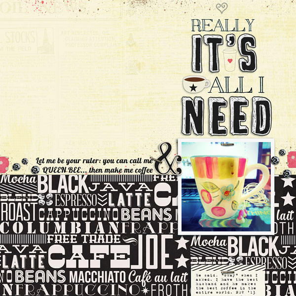
The pages above I did back in May. The one below is my latest homage to coffee. For this latest layout I decided to to play a little since I'd already jotted down my love of coffee and my excitement trying new blends, beans and brands. Since I've been listening to WOTE's cover of Lordes song Royals I thought it would be apt to to twist the lyrics into my title and subtitle. My journaling is about my hubby being my dedicated and loving barista. And when I asked him if he'd call me ruler without missing a beat he said okay. Yeah, he's awesome.

I really, really liked the colorful photo of my coffee cup and I loved the rhythmic, wordy paper. Together they'd just be too overwhelming, so I used the creamy covered newsprint to calm things down. Because of my song lyric inspiration, I used words like embellishments. I'm kinda in love with typography lately.
Anything I put on that bold, wordy paper might have gotten lost. That was a problem solved by the paper's design itself. I just aligned my photo and journaling card with the stars on the paper. Doing that tricks you into thinking it's more word art in the vertical column than word pattern paper.
I did use a few small embellishments to fill in the holes on my page and polished up the page with staples and paint splatters (because I always need a bit of mess on page).
This is a really great kit and I wanted to USE ALL THE THINGS!!! But using less things worked a lot better. Oh, and the kit is on sale this weekend. BUY ALL THE THINGS! :)
♥ Carrie

No comments:
Post a Comment
♥ Thanks for taking the time to comment. It is appreciated ♥