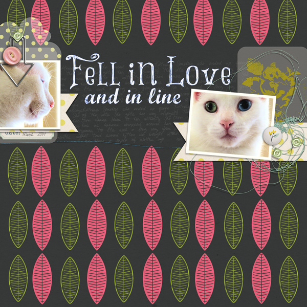
Linocut is a handmade, carved stamp that artists use for quick production. You can search Pinterest for a better idea or just read the article. I'm glad I work digitally because I don't have a good track record with Exacto knives!
For my page, I used layer styles to get the look of a linocut. I'm currently having a love affair with layer styles. They may be the one thing that pushes me over to a Photoshop subscription.

Jenni Bowling Studio: County Fair; Just Jaimee: Storyteller Collection- February 2014 Layer Styles, Ice Cream Paper Pack; One Little Bird: Lemon Drop Elements; HGD by Laurie Ann: Today’s Story; Fonts: Marcelle Script, Things We Said, Pea Stitchasaurus Rex
I used the Jenni Bowlin's primitive feathers available in the County Fair kit because they have that handmade feel. I used Jaimee's stamped layer styles to make the one feathers into a negative and positive stamp.
I found that font through a page by Vicki Bridges at The Daily Digi. It's an awesome, free font called Things We Said. The vellum bits add a some color and texture to the page without overwhelming anything while the pennants add a sturdy foundation that frame the title.
Oh, and that's my bossy little kitten, Katniss. She is definitely the queen of the house.


No comments:
Post a Comment
♥ Thanks for taking the time to comment. It is appreciated ♥