Friday, February 28, 2014

Smashing & Marching

It's been a very rough week, but there have definitely been highlights. One highlight was getting to play with the new March Storyteller, which I truly love. The other was the what I scrapped with it.

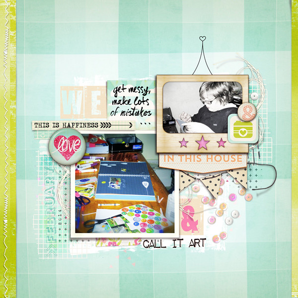
Call It Art

This is my kid working on his Smash Book. Being that he has a lot of fine motor skill issues, this sorta journal works well for him. He writes if he wants to, but he can also glue the heck out of anything, cut with wacky scallop scissors, use up all the washi tape, use stickers and whatever he feels like to his heart's content. It's more like an art therapy for him.

His life at the moment is so much about learning rules. Social rules. Grammar rules. Math rules. Science rules. Rules for his growing, changing body. At almost 13, there's so much that is new and foreign and so much to get wrong. But in his Smash Book? There's no wrong. There are no rules. It's a space where he can be him. It's blissful.

Being me, I decided to pick up my own Smash Book and some fun stuff for us to use. I also picked up some plain card stock for printing. Jaimee has great printables with her Storyteller Collections, so I'm excited to try it. I did some playing today because I needed a break from my guys:


I think this weekend I'll test out the printables in the March Storyteller for the live crop at Get It Scrapped all day Saturday (which you're welcome to join).

 photo 2faeb505-33f5-4d99-8a21-43b16f7025a3.jpg

Thursday, February 27, 2014

Scrapping Style Quiz

Have you seen this quiz yet? I don't how the magic happens, but after a few simple questions, you're style is revealed.  This is my result:


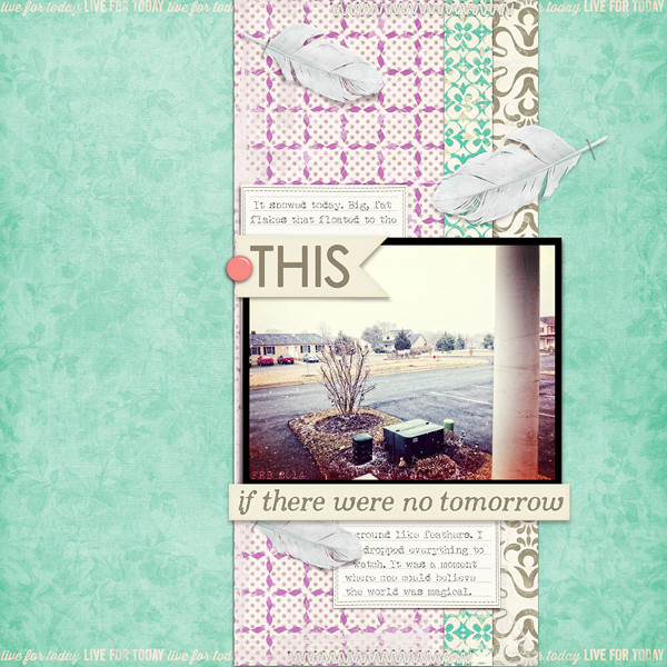
Now I'm even more excited for the upcoming Style class at Get It Scrapped. I definitely am not a literal theme person and I do love color. Here's a good example of the both things I created using this month's MSA Art Social:


If there were no tomorrow


Of course, there's my stash hoarding, which I do tend to shop to find the perfect kit for a story.  Speaking of hoarding, I had a huge blonde moment the other day. I have a 2TB EXHD. I told my hubby that I was worried because I had 130 some gigabytes on it. He laughed. 1000GB = 1TB. Mind blown in a I-feel-like-a-dork kinda way.


 photo 2faeb505-33f5-4d99-8a21-43b16f7025a3.jpg

Saturday, February 22, 2014

Style is Leverage


I am super excited for the newest workshop coming the Get It Scrapped: Style is Leverage. In my experience, I know so many scrappers who can't articulate their particular style easily, myself included. And if we don't understand our style, we have a harder time making choices that work for our stories and pages.

The class is 5 days long, will include PDF handouts, worksheets and there will be a LIVE webinar/chats daily (with recordings available the following day).

This class is designed for quick actionable results. At the end of Style is Leverage, you will:
  1. understand your story style and your design style
  2. know how to leverage your aesthetic preferences and personal talents for efficiency and successful creation
  3. have a personalized list of specific actions you can take to push your storytelling skills and artistry

Those three things excite me! It's a class I think everyone can benefit from, which is why I'm taking the time to share it. You don't need a GIS membership to purchase the class. Right now you can save 25% if you register before Mon. March 3, 2014. That means you can pick up the class for only $18!

You also have the opportunity to bundle the class with a GIS Membership where you get all-access pass to 45 classes, a new class the first Wednesday of every month & weekly live events for just $52 if you sign up before March 3, 2014. 

Oh, boy, I am can't wait!! (where's a bouncing emoticon when I need one?) 

I hope to see you there!! 

 photo 2faeb505-33f5-4d99-8a21-43b16f7025a3.jpg

Tuesday, February 18, 2014

Inside GIS: Black, White and Beige deconstructed design

Oh how I love using black, especially for text. It's classic. It grabs the eye. It can add a punch of color without using color. If I don't use black on page, there's a good chance I'm using a white or a beige in a similar way.

This page came together easily. I just happened to pull out all the neutral pieces I loved and let them do the work. The work is really in the intentional use and placement of each element.


love this 2

When I first signed up for the Critique Workshop over at Get It Scrapped in 2012, my goal was to learn how to scrap with intention. This is not an uncommon goal for memory keepers. The subject comes up over and over again at GIS and in Office Hours.

At first glance, you may just see color and shape, words and doodles and bits of paper making a simple page. If you look deeper into the page you may see the use of design principles and symbolism in this page. In case you don't, let me break down my intention for you:

1) The background paper. It's beige, it's got some messy spots and it's lined. The messy spots are not just symbolic of discomfort, but also gave me a place to start my composition. The lines help you move left to right, from title to photo. The color is soft, just like a kitty.

2) The photo. It's sepia toned to bring out the squinched up face while keeping the idea that kitties are soft and lovable even when they say "eww".

3) The circles.  Circles are a visual representation of predictable cycles. This face happens regularly at predictable moment. The predictable nature of a circle also makes a stable foundation for a loose composition.

4) The frame. We frame things that are special to us, but getting a photo of this sort of moment with an animal isn't easy to capture, which is why the frame sits behind the photo.

5) The title. It's a direct statement of my feelings. It physically supports the left side of the photo (adding balance), keeping the photo cluster from feeling like it will tip over. It also adds visual interest and energy with it's contrast and lines. It is softened just a tad by creamy, transparent version underneath.

6) The doodled line. It frames the page, so your eye gets ping-ponged back up the page. The lines also symbolize time passing.

7) The bow/string. These are a few of my favorite things... The expression makes me laugh and laughter is a gift. James is a gift, really. The lines of the string feel like they are in motion, which works great when your story is about action. It connects the title and photo cluster, too.

8) Journal strips. I digitally cut these. They were rectangles that are warped and skewed to make them feel hand cut. I also warped the text to match the curves in the paper as it pulls away from the background. The strips add visual interest, energy, but also stability because of their repetition.

9) Stitches. Not only do they add polish to the page (affixers do that), the angle of the stitches lead us into the composition.

10) Tape and sequins. Sparkles and glitters add a sense of motion to any layout because our minds know they continuously reflect light. (think Gestalt)  Using these embellishments is an easy way to add interest and polish to page at the same time.

A simple page is rarely ever simple. You can't hide mistakes and you must rely on the principles of design to pull it off. If you want to know more about the design principles, I highly recommend joining us with a Get It Scrapped membership.
 photo 2faeb505-33f5-4d99-8a21-43b16f7025a3.jpg

Friday, February 14, 2014

Happy Valentine's Day

Love, love, love... I love love!

Here's why I best husband ever:


I love his drawing of a present complete with washi tape... and the fact that he couldn't remember the specific content I wanted. It's so him. *swoon*

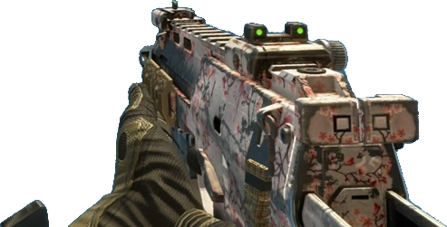
Also, I now have the Cherry Blossom cammo for my MP7 in Call of Duty: Black Ops 2. That means my gun is now pink with flowers. Not only do the other players get to see that they were killed by Death_By_Mommy, but now they get to see their death by a pink gun! Yay girl gamers!!


Here I am winning with my pink gun. I ended the game with 22 kills and 11 deaths, the highest in the game.


 photo 2faeb505-33f5-4d99-8a21-43b16f7025a3.jpg

Anti-awesome... scrapped

Just Jaimee and Mommyish have teamed up to create a (pocket style) kit called Real Life in Pockets- Candid that stresses life is rarely perfect. I've talked about this pressure to create a life-is-always-wonderful-here portfolio. You see it on layouts, you see it on social media, you see it in advertising. It's inescapable and it's depressing.

My life is messy, crazy, difficult and hardly ever perfect. I have more "Life is Awesome" word art than I could ever use. I was so grateful to see two of my favorite designers not just acknowledge life is never perfect, but embrace it with a little humor, a dash of snark and a whole lot of honesty.

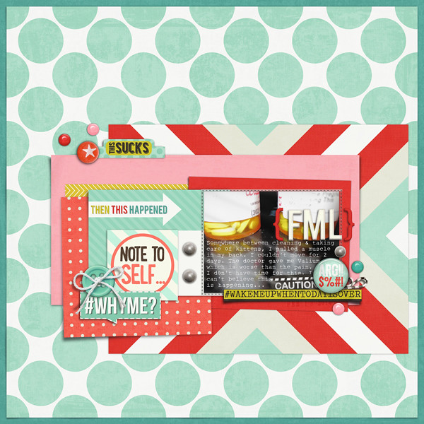
This page is about the cure for my back strain being worse than the actual pain. The doctor prescribed me Valium of all things. I'm think he prescribed it because he knows our family pretty well. Turns out the med doesn't agree with me at all.

FML

It's a huge kit and currently on sale. I highly recommend it, not just because I'm on her CT, but because everyone can relate to life being woefully imperfect. Scrapping about it is always therapeutic and revealing.
 photo 2faeb505-33f5-4d99-8a21-43b16f7025a3.jpg

Tuesday, February 11, 2014

Inside GIS: Constellation Motif

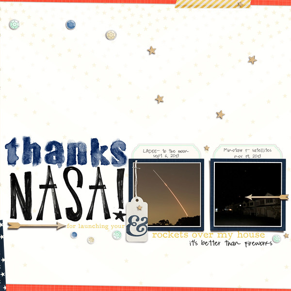
Today's Get It Scrapped blog post is about using a constellation motif on your pages. I was excited about this idea because we have front row seats to Wallops Island. When they launch rockets all we have to do is step outside and look up. It's extraordinary.

(Forgive me if I am hazy- I'm under the weather at the moment)

I used a kit from One Little Bird Designs and alphas from CD Muckosky to compose the page. I have photos of the launches, but to get good photos of things of the night sky, you really need a telescopic lens on a DSLR and not a tiny point and shoot camera. The tiny dots on my photos just failed to capture the magic of the story.

Wikimedia Commons and Flickr Commons  are two great resources for finding free to use photos that don't violate copyright. In the end, I used this great photo by John Hanson.  Creative Commons licenses are awesome!

You can read the article to find out how I approached this motif along with other great ideas (and there are some amazing pages there). 

The white background is really a great ombred star paper that I duplicated and overlayed to wash out the stars and amp up the white. It may seem counter-intuitive to have a white background for a story about a night event, but that's exactly why I picked it. Against the white, the colors and photos pop. It also allowed me to use my text in yellow, instead of black (something I rarely do, but broke out of my with here).

As always, I framed the page with some borders, skewing them to give the overall page a bit more energy. Since my scatter, photo and title blocks are very constructed and orderly, I did some scattering and broke the border with the ampersand (the & is for the two launches, in case you are wondering).  


thanks nasa

 photo 2faeb505-33f5-4d99-8a21-43b16f7025a3.jpg