
The first is about our printer. We don't get along with our printer. I don't think I've ever owned a printer that worked well. One day a few months ago, I woke up to to what looked like printer-pocalype. My husband tried to print a document and ended up printing every single document that has ever been in our printers queue.
This is how he feels about our printer (warning- the music in this clip drops some f-bombs):
I started the page with the title and the photo. I knew I wanted to use the overprint technique on the title which was Accept Print Failure As Part of the Process. That's how I'm able to keep my cool when using my printer (and why my hubby is not). The photo wasn't pretty so I wanted the title to be the focal point.
I created the title without the repetition of the word "print", so it was just a block of text. I also added the framed photo on the right. The title just floated on the page, so I decided to fill out the column with the word "print" knowing it would echo the story. It took me awhile to figure out repeating the frames would do the same and give a place for journaling to live. The embellishing is minimal, but if you look hard, you'll see that I actually ran the word "print" down the left and right edges of the page. The arrows also repeat (it's actually tape) on the bottom right.
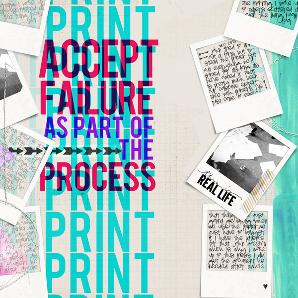
Sara Gleason: Tea Rose; Amy Martin: Blanc Stitches v. 2; Pink Reptile Designs: Tape It; Just Jaimee: Storyteller March 2014- Paint, Imprint on Me; Brandi Sutherlin Designs: Stamped Dates; Font: Bebas, Pea Twist Me Pretty
The next page was for Channeling Doris Sander. I love Doris' Style. It's quirky, inviting and thoughtful. She has this ability visually connect with the viewer that is so endearing and so Doris.
I had these photos from our last 12 hour power outage that interrupted our very digital Saturday. I was in the middle of finishing up some work and the kid had plans to play with a friend online that he'd been looking forward to all week. We made the best of it with family time instead. I wanted to take Doris' style and put my spin on it, so I picked out the things I always notice about her pages- see the article. Her style meshed well with mine and doing this helped me feel more confident using multiple patterns, which is something Doris embraces.
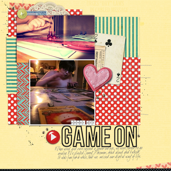
Amanda Yi Designs: This Just In; Kaye Winecki: You & Me; Queen of Quirk: Better Than Ever Alpha; Fonts: dearJoe 1 M&S
The last page I'm sharing with you today is a Jenni Bowlin page. Oh, how I love these products. I also love having a girl kitty for whom I can create feminine pages. Kitty Katniss (her official name) sleeps on the couch next me when she sleeps. When she's not sleeping, she's talking. Talking to me, to the other cats, to ceiling, to the birds outside, to anyone who will listen. She is also loud and persistent.
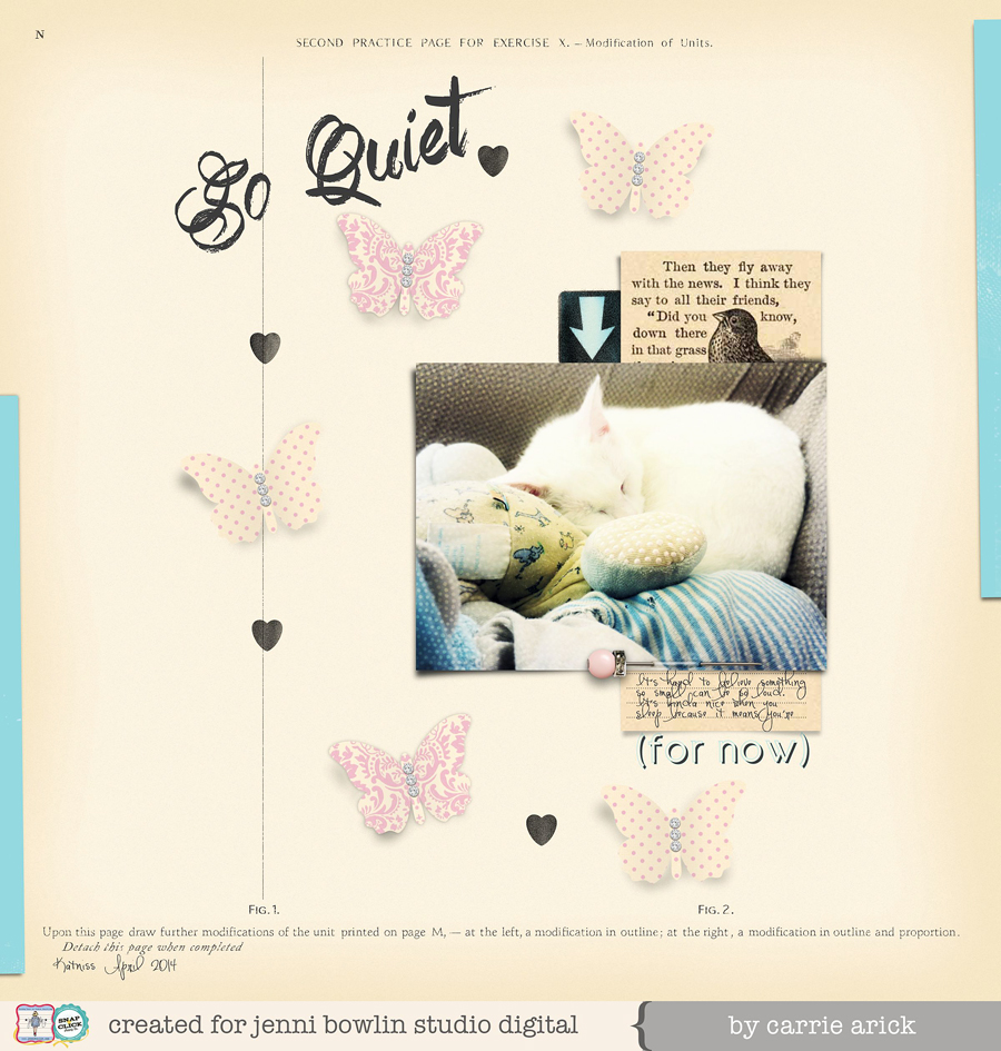
Jenni Bowlin Studio: Jeweled Butterflies, Vintage Bling, Vintage Cream & Black Collection, Sunny Skies Papers, County Fair, Speech Bubbles, Wren Collection; Fonts: Art Brewery, Circle Shadow, Pea Miley Mix
Tips: For the butterflies, I warped the shadows to give them depth. You can use smudge in PSE for a similar effect. I made the hearts and arrow speech bubble stamped by running the eraser tool over it with reduced opacity and hardness. It's quick and simple. You could also use Jaimee's layer styles for more stamped looks.
P.S. My hubby did well with his heart procedure- no stent, no bypass, just diet and medicine treatment. Yay!!
No comments:
Post a Comment
♥ Thanks for taking the time to comment. It is appreciated ♥